
KABRIC Bloom

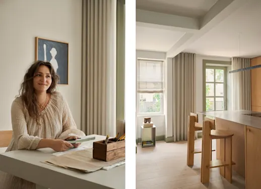
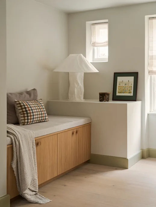
In Fie Hetting’s home, colours are not treated as isolated decorative gestures, but as elements within a coherent spatial system. They move through the house, reappearing in new contexts and establishing connections between rooms with different functions and atmospheres. Some shades assert a distinct presence, while others form a quieter background. Together, they create a carefully balanced composition in which light, materials and architecture are allowed to interact.
“Our choices of colour and materials do not suppress the energy, but give it resistance and balance.”
For Fie, a successful colour scheme is therefore defined not by the number of colours it contains, but by the relationships between them. A home can accommodate contrast, depth and moments of surprise when its palette is anchored in a clear idea. The colours do not necessarily need to resemble one another, but they must be able to enter into dialogue.
The colour scheme began with an intuitive sense of how the rooms should feel.
The approach is both sensory and analytical. Colours are not considered in isolation, but in relation to daylight, existing materials and the objects that already belong to the home. A shade may appear quiet in one room and more pronounced in another, because what matters is not simply its individual character, but the role it performs within the composition as a whole.
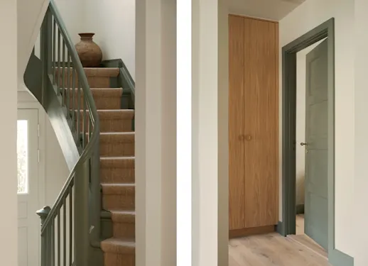
Painted in DETALE’s Earth Green, the staircase forms a vertical axis of colour between the different levels of the house. Visible from several points within the home, it becomes a recurring architectural reference. The deep shade accentuates the structure of the staircase and gives it a tactile presence that shifts with the changing light and movement through the interior.
Earth Green is more than a distinctive surface. It guides the eye and establishes a visual centre of gravity to which the surrounding rooms can respond. The staircase consequently becomes both a physical and chromatic connection: a continuous element that holds the home’s varied atmospheres together.
“The colours connect the home.”
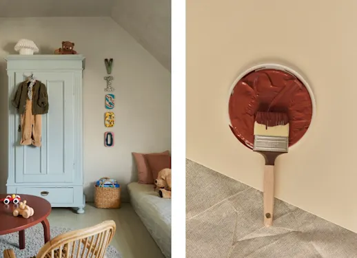
In the children’s room, KABRIC Mushroom extends across both walls and ceiling. This continuous treatment gives the space a warm character, while the subtle variations of the KABRIC surface introduce depth. Rather than meeting a perfectly uniform plane, light travels across delicate traces and shifts within the texture.
Mushroom creates a composed setting for a room otherwise defined by activity, play and change as the day unfolds. The colour does not suppress this energy, but gives it resistance and balance. Its sensory quality emerges in the tension between the movement of the room and the quiet weight of its surfaces.
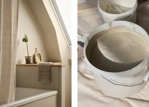
In the bathroom, KABRIC Bloom was selected in response to the materials already present. Its delicate shade continues the room’s muted tones, creating a transition in which the existing and the new settle naturally alongside one another. Rather than reshaping the space through contrast, the colour draws attention to the room’s inherent qualities. The KABRIC surface has been finished with DETALE Strongcoat for greater durability and washability.
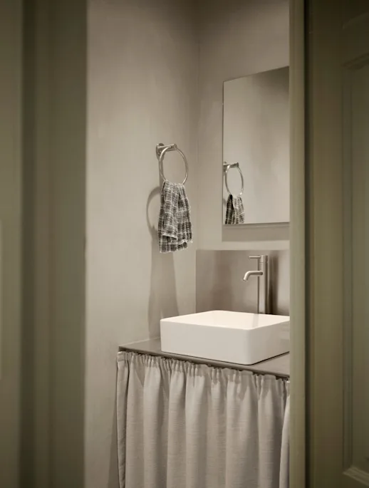
KABRIC Pale Beach unifies the surfaces of the compact guest washroom in an almost monochromatic expression, turning the room’s limited scale into a quality rather than a constraint. Repeating the shade on the dining table is a deliberate compositional gesture that creates recognition across the home’s different rooms and functions.
It is through such repetitions that the palette acquires its intellectual clarity. The colours do not operate as isolated statements, but as recurring motifs within a larger composition. They create rhythm, recognition and variation, allowing the home to feel complex without becoming restless.
“Our home should feel like a home.”